Have you ever felt like your business’s online presence just doesn’t reflect the quality of your work? (Maybe your site is cluttered with outdated fonts, inconsistent colors, or too much text that overwhelms visitors instead of inviting them in?)
You’re proud of the results you deliver, but your website and branding make you look like a disorganized amateur.
That’s exactly where my client, Heather, found herself. As a dedicated Independent Educational Consultant (IEC), she’s a trusted guide for teens and their families navigating the college application process. Heather is deeply loved and respected for her expertise.
But her DIY logo and out-dated, text-heavy website made people hesitate to reach out, thinking… “I’m not sure she’s even in business anymore.🤷🏼♀️”
With plans to grow her business—and a big dream to serve more first-generation college students through an equity-focused sliding scale model—Heather needed an online presence that felt as polished, professional, and vibrant as she is.
This is the story of how, through a four-day branding and web design process, I created a new brand that was as much of a perfect fit for her as the dream colleges she helps her clients get into.
Keep reading to learn how she walked away with a logo, website, and brand clarity that prepared her to raise her rates, streamline her work, and continue expanding her impact.
A Trusted Pro with a DIY Image
Heather’s work is all about helping teens find colleges where they will truly thrive. She believes in the life-changing power of education—a belief rooted in her own childhood, growing up in a diverse urban environment with parents who instilled the value of learning in her and her friends.
After guiding her first child through the college application maze, Heather turned that passion into a thriving consultancy. Families trust her to help their teens navigate applications, essays, deadlines, and decisions—without arguments and eye-rolling at the dinner table.
But Heather’s brand and website didn’t reflect her professionalism … nor her warm, approachable energy. Her logo? Created by one of her children—with far more love than finesse–with some obscure online service. Her website? An outdated DIY effort with no design strategy and blocks of small-font text that would make readers’ eyes glaze over… or even made them leave the site entirely.
Heather had reached the point where she wanted to raise her rates and reach more families beyond word-of-mouth referrals. But with her current online presence, the disconnect was too obvious. “I’m so proud of what I do,” she told me, “but I’ve never made my website a priority…”
She also lacked both the time or the know-how to fix it herself. So when I began promoting my new DesignDay format, Heather saw it as the perfect opportunity to finally get a professional, cohesive brand worthy of her incredible business … and start the new year off right.
So, she booked a few DesignDays, and we got to work!
Day 1: Brand Clarity & Color Palette
Our work began with a Brand Strategy Intensive. Heather filled out my signature Goldmining Workbook, reflecting on her business, her clients, and her big vision. Then we dove into a long Zoom session where I asked deeper questions to uncover the heart of her business.
Heather found a lot of value in this process:
“It’s actually a lot like what I do with kids – getting them to tell their own story. And it’s not as easy as I thought. This will make me better in my practice, more sensitive to the fact that getting those stories out of kids takes time and it takes trust.”
By the end of this Brand Strategy day, we:
- Pinpointed Heather’s “magic“: her joyful, bubbly enthusiasm for helping teens find their perfect-fit schools, and her deep commitment to making education more accessible for all.
- Crafted a positioning statement, a clear, compelling offer summary that now anchors her messaging.
- Honed in on her ideal clients: parents who value a collaborative, child-centered approach and teens who want a guide who “gets” them.
- Reviewed pricing for explored how to increase efficiency in her business (Bonsu: when clients work with me, they usually get a little side serving of business coaching and strategy.)
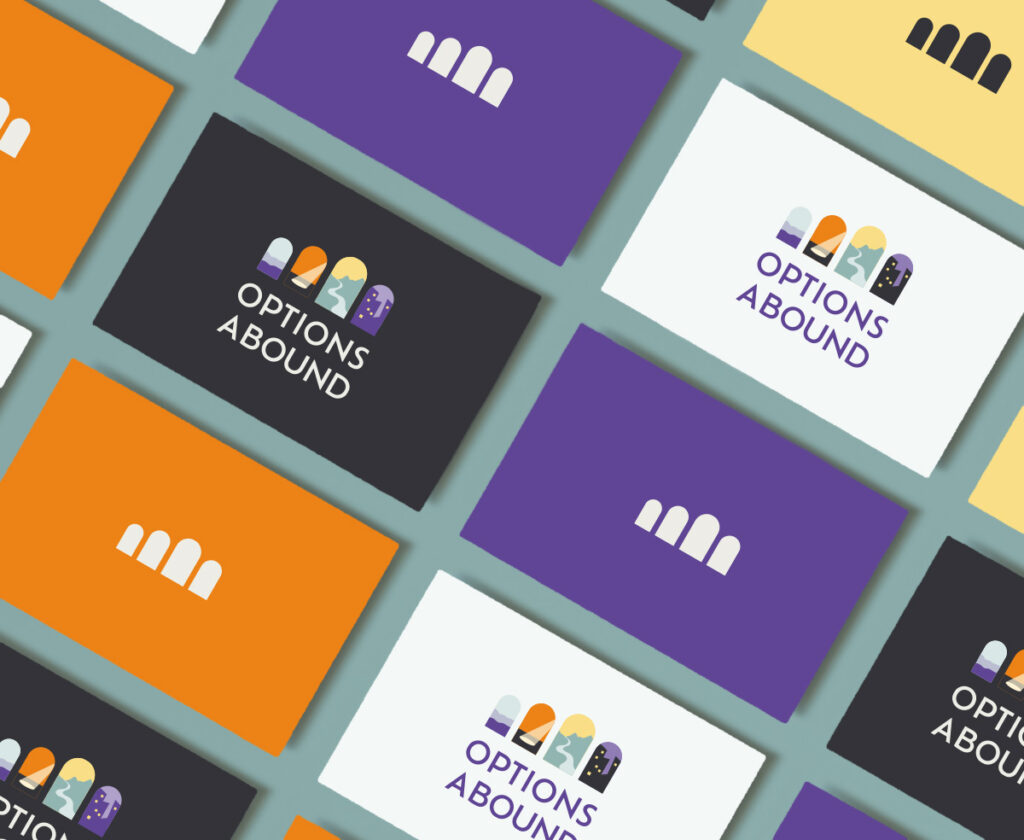
- Curated a color palette to reflect her brand’s energy. I chose vibrant orange and purple as the core colors—dynamic, inviting, and reminiscent of classic college “school colors.” A pop of sunshine yellow adds a youthful spark, while a calm light turquoise and sober charcoal keep the palette from feeling too playful – and make it functional for all the places she’ll apply her brand.

Day 2: A Logo That Opens Doors
Designing Heather’s logo was all about capturing her belief in the transformative power of education. During our strategy session, she kept mentioning how “education opens doors.” That phrase stuck with me.
In a flash of insight, I knew what we needed to do for her logo. I quickly sketched a few ideas on paper, snapped a photo with my phone, and texted it over to get her reaction.
Heather immediately lit up: “I love it! 😍”
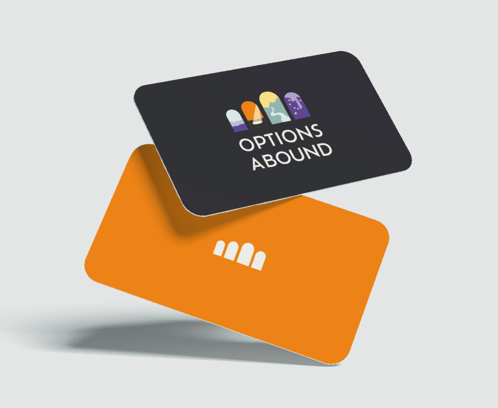
The final logo design features four arched doorways, each revealing a different scene: a shoreline, a city skyline, a winding path into the sunset, and a spotlit stage. These doorways symbolize the diverse possibilities ahead for Heather’s students, and the unique life paths each of them can choose – through college and life. Those choices and possibilities might include: rural or urban lifestyles, natural sciences or the performing arts, peaceful intimate places or rugged challenges.
The suite of logo variations I created also provides Heather with choices – and flexibility – when using the logo in the real world. The variants scale beautifully across her website, social media, and printed materials—a major improvement from the pixelated app-created version she started with.
Heather is ecstatic about the final result: “The logo, those arches… it’s just is perfect, you nailed it! I would not have been able to come up with that, because I’m just not a creative person.” And this kind of outcome is only possible because of the deeper foundation, the brand strategy conversations, that we started with.

Day 3: Website Content that Speaks Resonates and Educates
Heather used my Next Level Website Workbook to draft new, client-focused text for her website. I guided her to describe the specific things prospective clients need to hear to be ready to buy.
We structured the homepage like a story:
- Beginning: Paint a relatable picture of the stress and confusion many families feel about college applications.
- Middle: Teach readers why it can be stressful, and show how Heather’s collaborative, organized and supportive approach makes the process smoother and less overwhelming.
- End: Showcase success stories and highlight Heather’s personal, values-driven philosophy.
And then I helped her polish and streamline it, pull out the juicy phrases for headlines, and revamped her client testimonials—turning long rambling paragraphs into punchy, attention-grabbing quotes that illustrate Heather’s impact.
(Nowadays, I still help my clients with the messaging and structure, but hand of the polishing to a professional writer to ensure that all the T’s get crossed and I’s get dotted.)
Days 3+4: A User-Friendly Website
Lastly, I designed a website that balances visual appeal with practical functionality. Using Elementor on WordPress, we created:
- A vibrant homepage featuring diverse student images, framed by those signature doorways.
- An easy-to-navigate structure that guides visitors to book a free consultation.
- An automated scheduling tool, reducing some of the endless emails that had been eating up Heather’s time.
I also provided Heather with a live 1:1 training and custom Loom video tutorials so she can easily update the site herself —while knowing that it will always look great.
The Results: A Boost of Momentum for 2024
Heather’s brand transformation delivered exactly what she needed:


When we were all done, Heather remarked: “I’m super thankful for this entire process. It was way more than I expected – in a good way!”
Ready to See Your “Magic” Come to Life in a Custom Brand?
Have you been dreaming of a logo and brand that truly captures YOU, your energy, and the impact you make in the world?
Let’s chat about how we can make it easy for your audience to see and FEEL that
(No pushy sales tactics here
…

